
What Price History Tools Actually Track
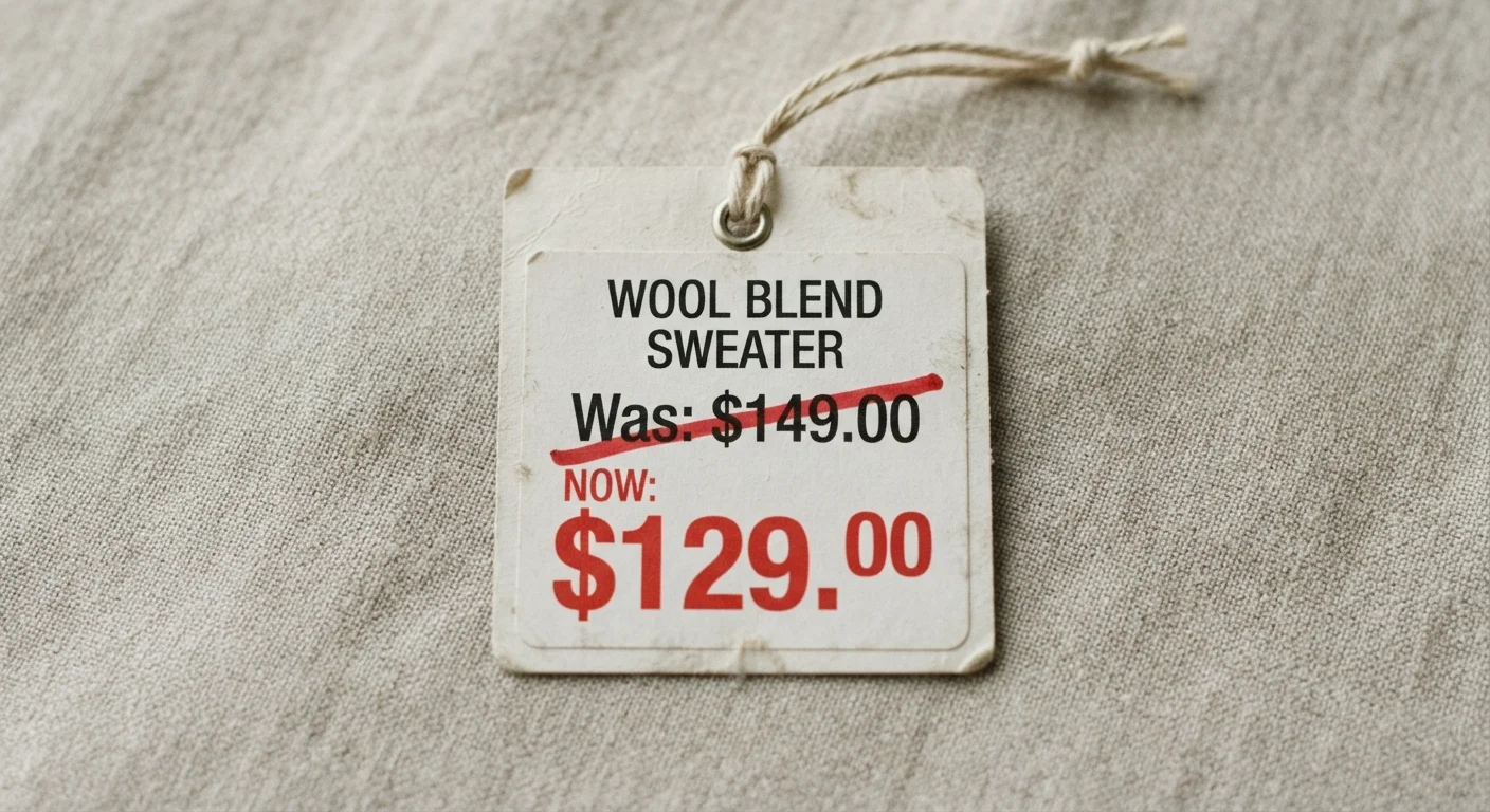
When a retailer shows a crossed-out 'was' price next to a sale tag, there's no requirement that the original price was ever the norm. Price history tools cut through that by showing you what the item actually sold for - day by day - over weeks or months. Understanding what those charts represent (and don't) is the first step to using them well.
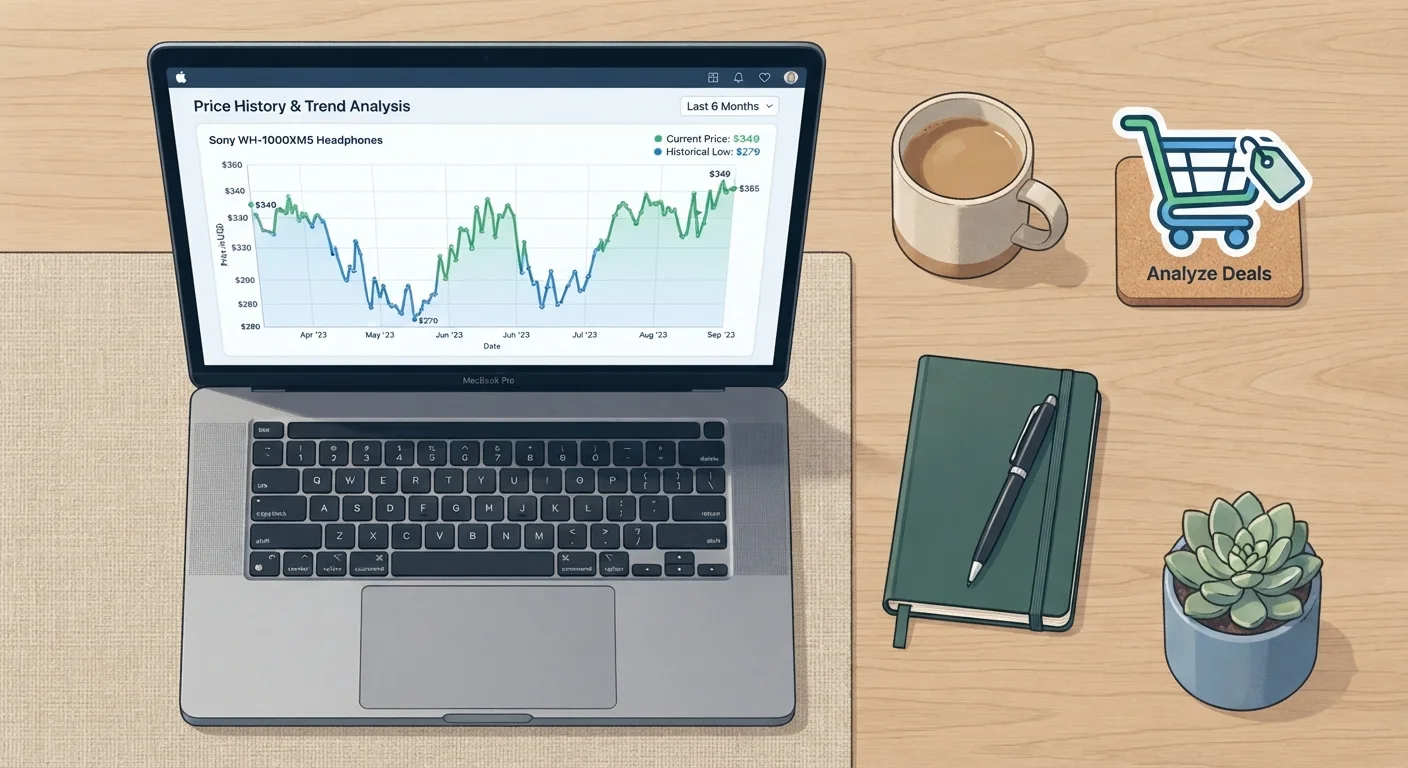
Most tools track the publicly listed price on a product detail page at the time of each automated check. They store that figure as a timestamped data point. When you open a price chart, you're seeing those snapshots stitched into a line graph. The key metrics to look for are: the current price, the all-time low, the all-time high, and the average price over a defined period - typically 30, 90, or 180 days.
The 90-day average is especially useful. If the current price is meaningfully below it, the discount has at least some grounding in reality. If the price is above the 90-day average, the 'sale' framing should be ignored. For more on why advertised discounts often misrepresent true savings, see our explainer on why 'Was $99, Now $49' doesn't always mean you're saving money.
~22%
Products with inflated pre-sale prices
Research by consumer watchdog groups in the UK and US has found roughly 1 in 5 'sale' items had their reference price raised shortly before the discount period began.
90 days
Recommended price history window
Consumer advocates generally recommend reviewing at least 90 days of price history to distinguish a genuine low from routine price cycling.
15-30 min
Price check interval for most tools
Many browser-based price trackers poll product pages every 15 to 30 minutes, meaning very brief flash prices can still be missed between snapshots.
How to Read a Price Chart - and What to Ignore
A price history chart can look straightforward but contains important nuance. Here's how to read it without being misled.
Spike patterns before major sale events
Look for a sudden price increase in the days or weeks immediately before a 'sale.' This is a common reference-pricing tactic: the retailer raises the list price to establish a higher 'was' price, then drops it back - presenting the original price as a discount. On a price chart, this appears as a sharp spike followed immediately by a drop. The 'deal' price is often just the item returning to its normal range.
Steady declines vs. manufactured urgency
Some products genuinely decline in price over time - electronics after a new model launches, for example. A price history chart showing a gradual downward slope over months suggests a real trend. Contrast this with a price that has been stable for months, briefly jumps, then falls back - a clear manufactured discount signal.
The noise in third-party seller prices
On marketplaces where multiple sellers list the same item, the displayed price can swing widely based on which seller is featured at a given moment. A price chart that shows extreme volatility - not gradual movement - may reflect seller rotation rather than genuine price changes. This matters more for used or refurbished goods than for new items sold directly by the retailer.
Where Price History Tools Fall Short
Price trackers are useful, but treating them as the whole picture leads to mistakes. Here are their real limitations.
- They miss checkout-level savings. Coupon codes, loyalty points, cashback, and stacked promotions applied at checkout don't appear in price history. The effective price a savvy shopper pays can be lower than any chart reflects.
- They don't capture member or geo-targeted pricing. Warehouse clubs, subscription tiers, and regional pricing are typically invisible to tools that scrape unauthenticated public pages.
- Coverage varies by retailer. Most tools have strong data for dominant e-commerce platforms and thinner data - or none - for smaller retailers and direct-to-consumer brands.
- They can't predict future prices. A current price at an all-time low could go lower, stay flat, or rise. Price history describes the past; it doesn't forecast the future.
Pairing price history data with knowledge of when genuine seasonal discounts actually happen gives you a more complete decision framework than either tool alone.
It's also worth considering that price is only one dimension of a purchase decision. What 'value for money' actually means depends on how often you'll use something and how well it fits your actual needs - not just whether the number on the tag is historically low.
This article is for general informational and educational purposes only. Pricing data, tool availability, and retailer practices change frequently. Always verify current prices and conditions directly with the retailer before making a purchase.